PCA
We'll be working off two different images - one from around here, the other from Oz. Both files are in the lab 8 subdirectory. One is a cut down version of our usual landsat 8 scene of kitco, this one containing the visible, NIR, and MIR imagery. The second image is from Eighty Mile Beach, Western Australia (also landsat 8, same bands, and from october 2016)
For all the questions, do them first for the kitco image, then the Eighty Mile Beach image. Hand them in as a single document, first all the kitco stuff, then all the 80mb stuff. I suggest doing the whole lab for kitco, then redo the whole thing for 80MB - rather than doing it a question at a time.
Note - this may well chew up a LOT of drive space. Also, there is a paper about PCA in the lab folder - Give it a read, though skim the math.
OK. Let's start by calculating the correlation between the various bands.
Unfortunately, ERDAS does not have a “button” to push to produce variance-covariance and correlation matrices. You must write a simple “program” to do it.
Click on the Toolbox - Model Maker button to open a new model and the tool bar. Programs created with the Spatial Modeler require inputs, functions, and outputs. This exercise will walk you through this model, and you will gain a better understanding of how it works.
First, you need an input file. The Modeler accepts raster or vector inputs. In this case, the input is raster. So, click on the tool that looks like this: ![]() . Now, click anywhere in the blank area of the modeler window. Your window should now contain the symbol for an input raster stack with a question mark underneath it.
. Now, click anywhere in the blank area of the modeler window. Your window should now contain the symbol for an input raster stack with a question mark underneath it.
The second step is to create a function symbol. Click on the icon ![]() and then click in the modeler window somewhere below the raster stack symbol. Your model should now contain symbols for a raster input and a function.
and then click in the modeler window somewhere below the raster stack symbol. Your model should now contain symbols for a raster input and a function.
Next, you need an output. In this case, you want a matrix as your output (since you will create variance-covariance matrix). Click on the ![]() icon in the tool bar and drop the symbol in the modeler window somewhere below the function icon.
icon in the tool bar and drop the symbol in the modeler window somewhere below the function icon.
You must now indicate the “data flow” through the model. Click on ![]() . Use this tool to “connect” the input raster stack to the function, and then connect the function to the output matrix (“drag” the arrow between the first symbol and the next).
. Use this tool to “connect” the input raster stack to the function, and then connect the function to the output matrix (“drag” the arrow between the first symbol and the next).
At this point, your model should look something like this:
Double-click on the input file in the modeler. This loads a dialog box that asks for the name of the input file. Click on the yellow folder icon under “File Name:” and select the appropriate image file. Click OK. Note that the file name is now shown under the input raster symbol.
Next, double-click on the function icon. This opens another dialog box. Make sure “Functions:” is set to Analysis. Then, click once on the selection COVARIANCE ( <raster> ). This inserts the covariance function into the bottom portion of the dialog box. You must define the <raster> variable. Using the mouse, “highlight” the word <raster> in the function and then hit the Delete key on the keyboard. Next, click on the “Available input:” - the general one, you want to use all bands, not specific ones. Click OK.
Finally, double-click the matrix symbol. In this dialog box, select Output (as you wish to create a matrix). Under “Write to File:” go to your working directory and call the output file “minot_covar”. Click O.K.
Click the red lightning bolt icon at the top of the modeler window to run the program. When complete without run errors, you now have some intermediate stats you'll need for the next part.
Now, run a correlation analysis. Go back to the model and add another function symbol. Then, add another output matrix. Connect the new symbols to your data flow with arrows. Your model should now look something like this: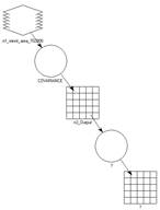
Double-click on the new function icon. Again, make sure “Functions:” is set to Analysis. Then, click once on the selection CORRELATION ( <covariance_matrix> ). This inserts the correlation function into the bottom portion of the dialog box. Now, however, you must define the <covariance_matrix> variable. Your input matrix is the covariance matrix calculated in the previous step. Using the mouse, “highlight” only the word <covariance_matrix> and then hit Delete. Next, click on the “Available input:” called n3_Output (or whatever the program is calling your covariance matrix). Click OK.
Double-click on the new output matrix symbol. Select Output. Under “Write to File:” go to your working directory and name the file. Click O.K. Click the red lightning bolt icon at the top of the modeler window to run the program. When complete, use Excel to view the file. Clean it up and paste it into your word document. Be sure to label the rows and columns in excel..
Question 1: Which bands are highly correlated (r greater than 0.85 - excluding band correlation with itself)? Why?
Question 2: Which band or bands show little correlation with any other? Why?
Question 3: What is the practical application of this type of correlation analysis?
Now, a little principal component analysis. Goto raster - spectral - principal component. set your input and output files. Stretch to unsigned 8 bit. Use all 7 components. And write both the eigen matrix and eigenvalues to files.
Take a look at the eigen matrix in Excel. It helps if you view it to three decimal places. The columns are the principal components. The rows are landsat bands. Effectively, these numbers are the correlations between each band and each principal component. Paste this matrix into your answer sheet and very briefly, explain the relationships between each principal component and the landsat data. Be general (ie... PC7 appears to be all about something that shows up only in bands 5 and 7). Question 4.
Import the eigenvalues file to excel and calculate how much variance each component captures (just the percentage each eigenvalue represents compared to the total of the eigenvalues). Paste that into your answer sheet (question 5). This is the percentage of the variance in the 7 original bands that is explained by each principal component.
Now, make sure you have two views open. Put the kitco image in one. Draw it whichever way you prefer (true color, desert, color IR, whatever). In the second, work your way through the 7 principal components one at a time (greyscale). It might help if you link the two views! What do you think each represents (question 6)?
Question 7: Zoom in and out in a number of areas. Which image appears to provide more visual detail (in what areas). Why do you think that? Provide significant detail. Pick three spots - but be sure to describe those three spots so I know where you're talking about..
Once you've done this lab with the kitco image, redo it with the 80MB data.